“Every color has their moment, and it looks like green is having its ‘moment’!” Ally Whalen, Owner, Ally Whalen Design
It’s that time of the year again! The major paint brands have announced their pick for the Color of the Year 2022. Unlike in previous years, a common trend has emerged. All eight companies we analyze in this report have opted for natural, earthy tones. Not only that, seven of the brands have chosen green. They range from bright to sedate and cool to warm in tone. Despite the differences in tones, the reasoning behind the choices seem to be quite clearly on par with one another.
We reached out to 49 of the top experts in the interior and home design fields to get their thoughts and preferences on this surprising new trend. They offer a unique look into these colors, the reasons behind their selection, as well as some tips and suggestions on how to incorporate them into your home. We wanted to know which they think will succeed the most among homeowners and how, and also their personal favorites as home design experts.
Whether you’re looking for a fresh start with these colors, want to understand what could be behind this trend in interior design, or understand the differences among the Colors of the Year 2022, we invite you to go through their insights, choices and suggestions.
What Are the Paint Brand's Colors of the Year 2022?
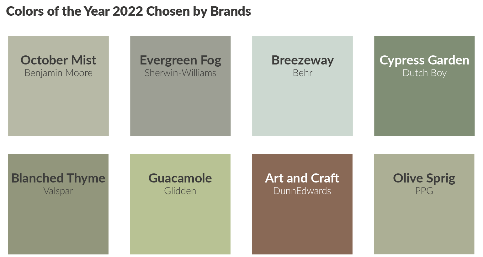
In this report we asked the experts to comment and analyze on the eight colors above, chosen by major paint brands for their color of the year. They include the following: (clockwise starting from top left) October Mist by Benjamin Moore, Evergreen Fog by Sherwin-Williams, Breezeway by Behr, Cypress Garden by Dutch Boy, Olive Sprig by PPG, Art and Craft by DunnEdwards, Guacamole by Glidden and Blanched Thyme by Valspar.
“It’s eye opening how so many individual manufacturers/suppliers gravitated to such similar hues. I think it makes a statement that transcends just home decor!” Patti Johnson, Owner, Patti Johnson Interiors
Why the Obvious Trend?
Given the uniqueness of this year’s common color trend, our first question was a must. How is it that we see such an obvious trend in the color of the year? Traditionally, brands have opted for different hues and approaches to represent the next year's color.
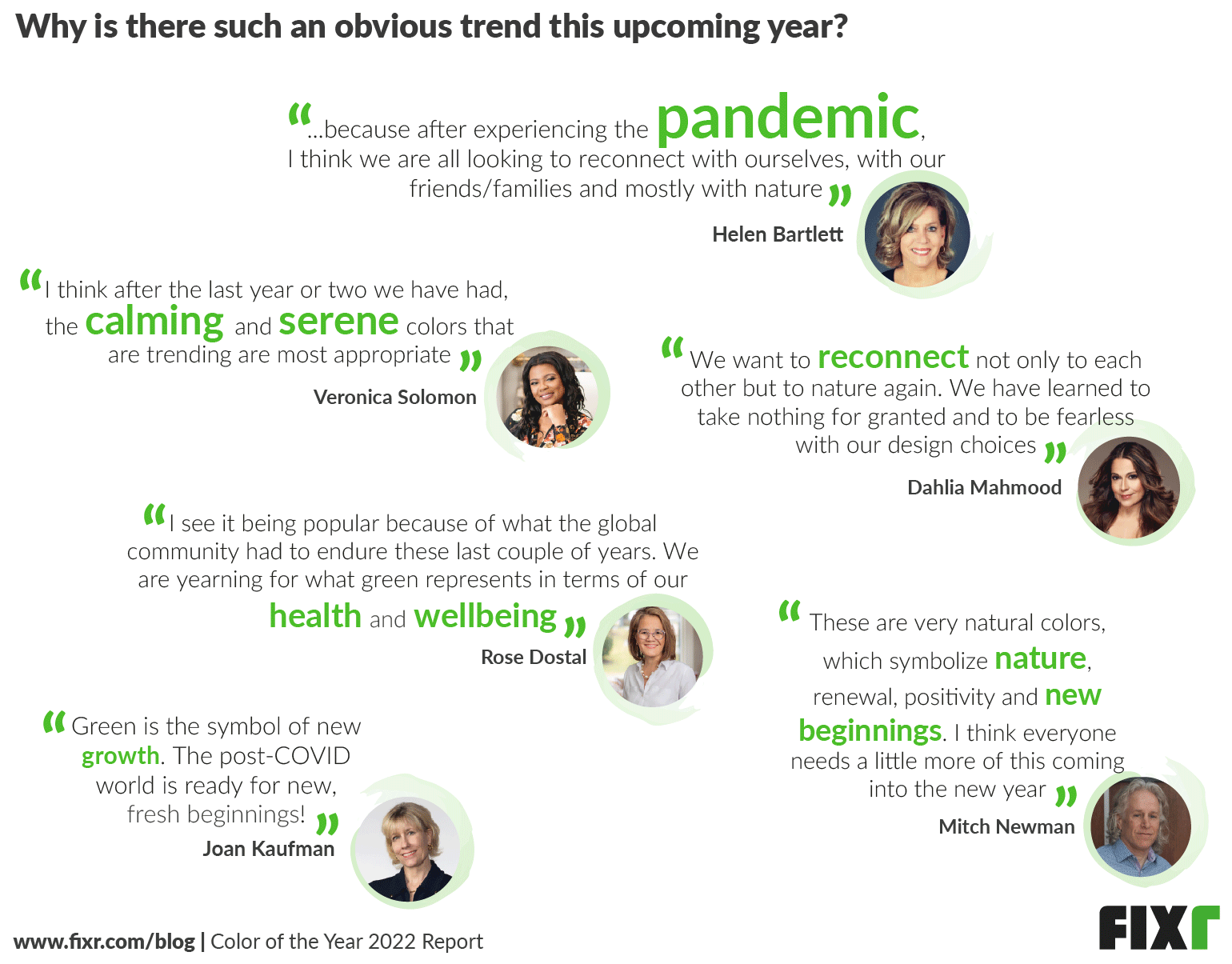
Although the responses offered up a variety of thoughts, most of them had one thing in common: the pandemic. What we’ve all endured during the past year and a half changed many people’s lives and relationships with their homes. Homes took on new meanings for people who now found themselves sleeping, eating, working, studying, and living all in one place. The yearning of people to get back outside and reconnect with nature seems to be the seed that planted this new color trend. Earthy tones give off a feeling of fresh, new starts also. It’s no wonder these hues are such a dominant presence in this year’s choices.
According to our experts, a color representation of nature is green, which is thought to be calming, serene, and tied to many things such as new beginnings, health, wellbeing, growth, and a sense of reconnection with our homes and with one another. Joe Nahem, from Fox-Nahem Associates, adds that these tones of green "...seem to work well with all kinds of interiors and are very soothing - in times when some soothing is needed."
These nature-inspired colors may also be inspired by a desire of many to bring the outdoors inside. As Kevin O’Gara, founder of Kevin Francis Design, explains, “...the outdoors has become an important escape and I think a lot of people have realized how much they take it for granted after being in their homes more due to the pandemic. Also, the effort to reconnect with nature in a bigger way with more natural products, sustainable brands and ethical consumption is finally being treated less like a trend and more like a direction that our future depends on.”
Green colors are associated with being eco-friendly and organic as well. This may mean that green as a color could be an outward expression of people’s desires for that. According to Michelle Cortizo, from Cortizo Interiors, “Greens harken to our environment and are healing by nature. From healthier living and preservation, to eating more organically, green has become more central to the way we live.”
What Will Be the Most Popular Color Among Homeowners?
Experts were asked to choose which of the eight colors they thought would be the most popular with homeowners. The colors in the top five positions are October Mist, Evergreen Fog, Breezeway, Cypress Gardens, and Blanched Thyme.
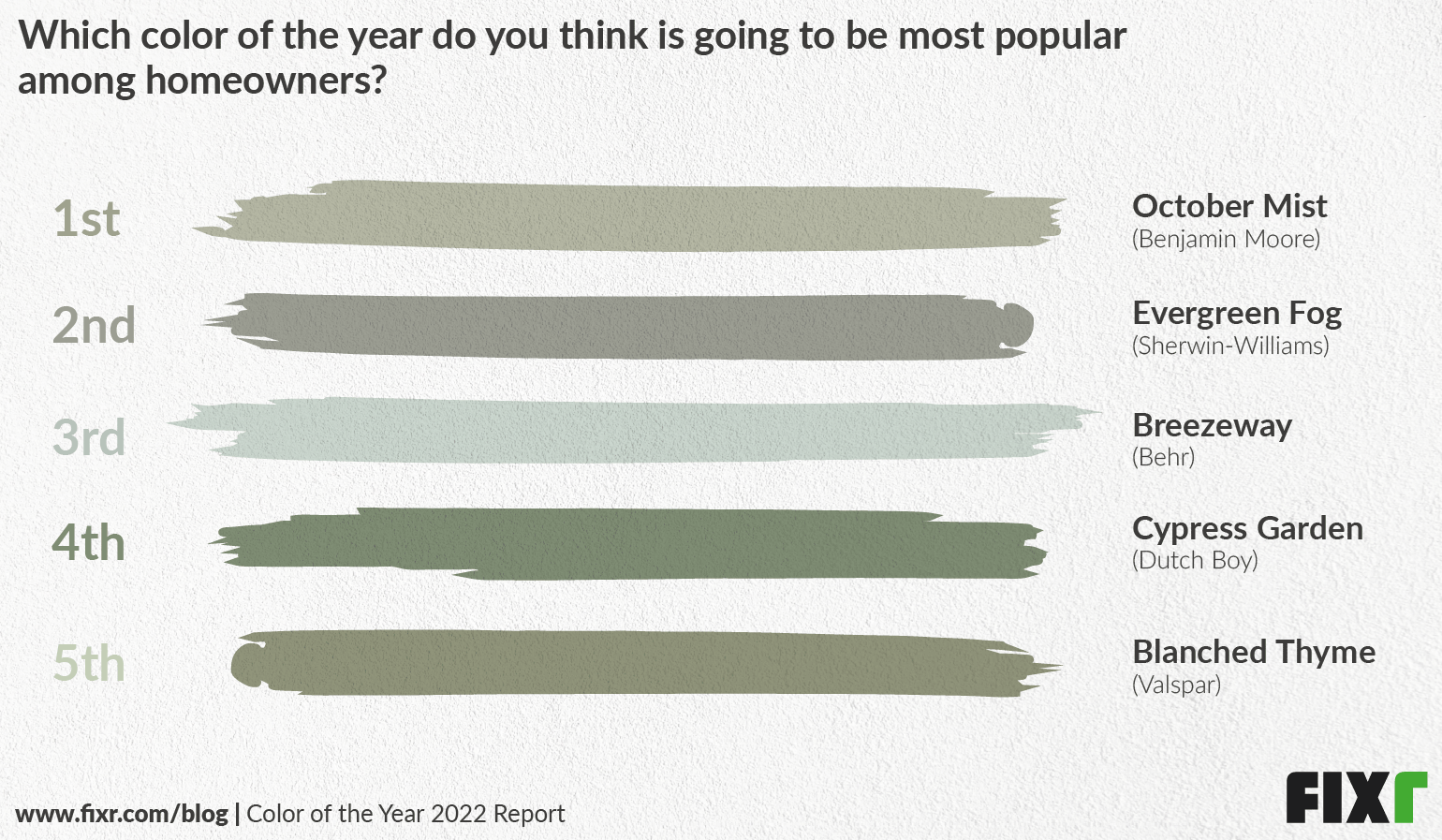
Experts had many thoughts on why they felt that the top three in particular were going to be popular among homeowners this coming year. Joy Moyler, from Joy Moyler Interiors, felt that October Mist is, “...the most 'accepting' of the green hues, and can be used geographically in multiple light sources without being too saturated.” This is important to note, because light sources can change a color dramatically from one area to the next. A color that can withstand this is likely to get more use than another. Joan Kaufman, from Interior Planning & Design, Inc., also thought the color, “... is soft and fresh and works well with analogous colors and as complementary colors”. This means that October Mist will work well with yellows and blues, as well as bolder shades like red and orange. This could make it easy to incorporate into color schemes people already have.
Patti Johnson, from Patti Johnson Interiors, noted that Evergreen Fog may be a good choice for people just wanting to tip toe into a new color, “This color is a grayed version of green and many, many people are just feeling comfortable to step outside the “gray zone”. Since gray ruled for so many years, this shade of green would also work with existing palettes and home decor, while allowing people to introduce something new into their designs. Kerrie Kelly, from Kerrie Kelly Design Lab, agrees by stating, “Evergreen Fog's versatility makes the shade easy to incorporate into a variety of spaces throughout the home without changing all of the elements of your decor.”
This may also be part of the appeal of Breezeway, which is one of the lighter shades on offer. Light colors may be easier to incorporate, as well as feel comfortable with at first. Stephanie Janecek, from Bruce Bierman Design, elaborates: “It's cool and calming without being too specific of a color to have to commit to a certain group of other colors to decorate with. It leaves room for more color options for accents.”
The one thing tying all of these shades together is their versatility. It’s possible to incorporate these colors into your home without having to reinvent your personal color wheel.
How Will Most Homeowners Incorporate Colors into Their Homes?
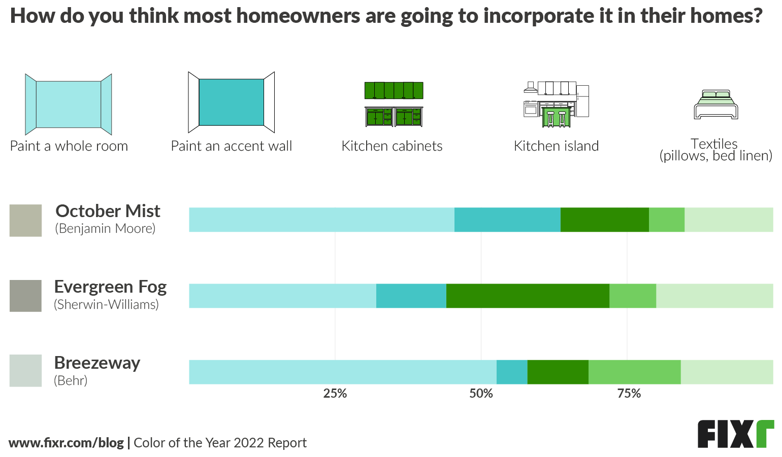
When using the top three colors according to experts, they had several ideas on how to best include them in your home. When it comes to painting the whole room, most experts agree that Breezeway will look best this way, with more than 50% agreeing. It’s also favored more for textiles and kitchen islands than it is as a bolder accent color or cabinet choice.
Evergreen Fog, however, is the top choice for painting cabinets as well as for painting walls. It’s also more heavily favored as a linen or textile color as well.
October Mist is strongly favored as a wall color, and gets the most votes for use as an accent wall. It’s the least favored for textiles or for kitchen islands, but many experts still feel it would work well as a cabinet color, too.
Experts’ Personal Favorites
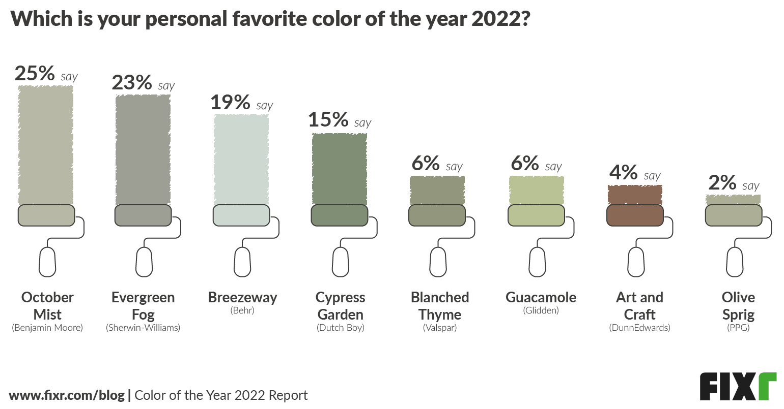
When it comes to personal favorites among experts, colors are more diverse than what experts felt that homeowners would choose. While the top three - October Mist, Evergreen Fog, and Breezeway - remain the top three, the overall spread was much wider, with the bottom three choices getting more votes here.
This may be because interior designers are more comfortable both with color and with bold choices. It’s easier for those who work with color, textiles, and finishes every day to see connections and visualize how something will look in a space. Therefore, while a homeowner may shy away from a bolder choice like Guacamole or a dark option like Art and Craft, interior designers may see more ways of incorporating them into their own homes.
In Which Circumstances Would You Use One Over the Other?
Color may be subjective, but things like location, light, and architecture can have a big impact on how well a color performs in a certain space. While these are mostly shades of green, some are lighter, some darker, some cooler, some warmer, and some more dynamic than one another. As Todd Davis, from Brown Davis Interiors, states, “The use of each green is really dependent on the light a room receives, the intended purpose of the room and of course the geographic location. A color such as mist is more neutral and gives a hint of color and a deeper color such as fog is more defining.” This means that placement and undertone can make a big difference in how a color is ultimately perceived.
A dark space may cause a color to read very differently than one lit by natural light. Kevin O’Gara explains,
“When choosing green paint, the undertones are very important because green is a color that can morph very quickly with different types of light. Greens with cooler undertones like Behr's Breezeway will look pale blue in natural light, and green in indoor lighting. This can be beautiful in a dining space where it will feel very refreshing during the day, and cozier at night. Very neutral greens like Sherwin Williams Evergreen Fog will look more grey under indoor lighting, but still have a nice subtle depth in daylight, so I'd recommend it for a living space.”
Style also plays a role, with some colors fitting in better with historical settings, and others working better in a modern home. According to Veronica Soloman, from Casa Vilora Interiors, “It would depend on the style I am trying to achieve overall. I could see using Behr's Breezeway or BM October Mist in a more modern space, whereas I would use Valspar Blanched Thyme in a more traditional or farmhouse style”. Barbara Segal, from Barbara Segal & Associates, agrees, “Olive Spring, PPG leans toward yellow, making it a choice for a space that is more traditional or historic, highlighting a variety of wood tones.”
All of this means that while at first glance you may see a lot of green, there are also a lot of subtleties involved that may make or break a color when used in a specific space.
Comparing the Colors of the Year 2022
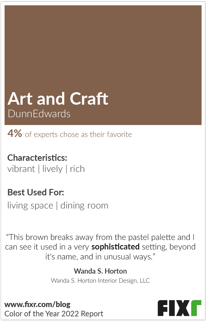
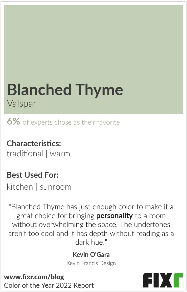
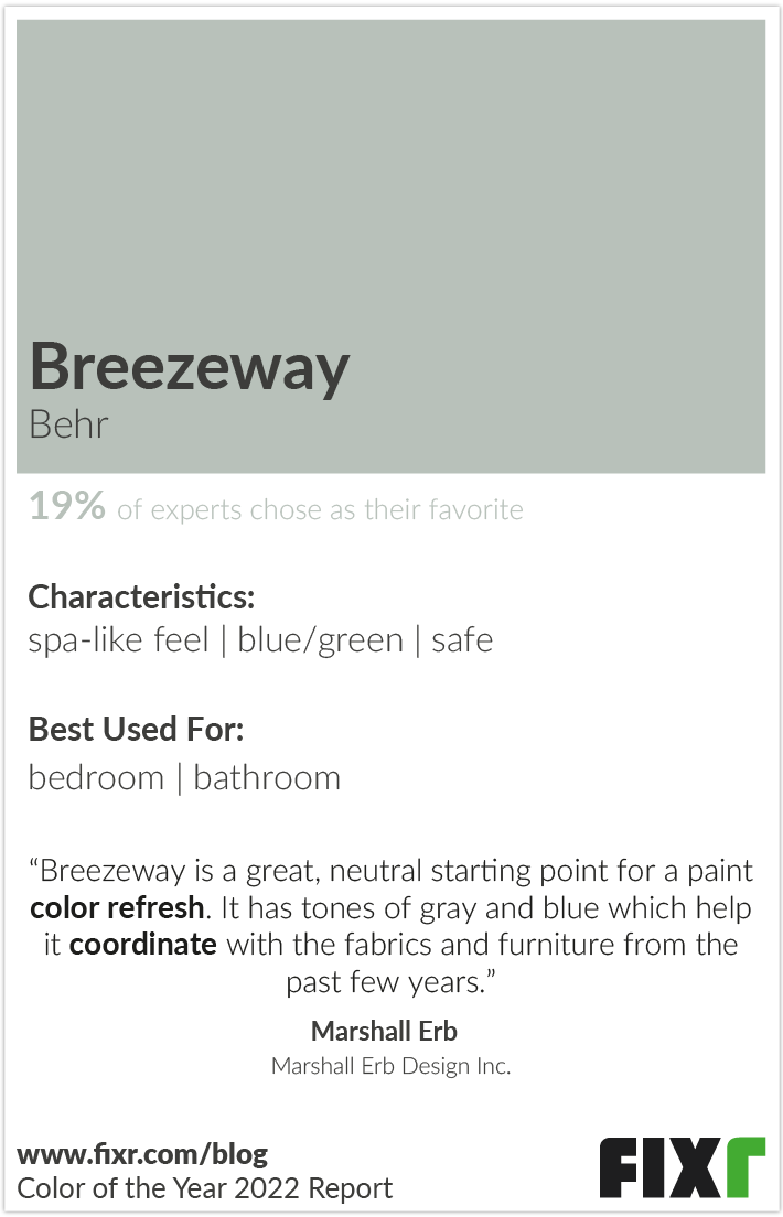

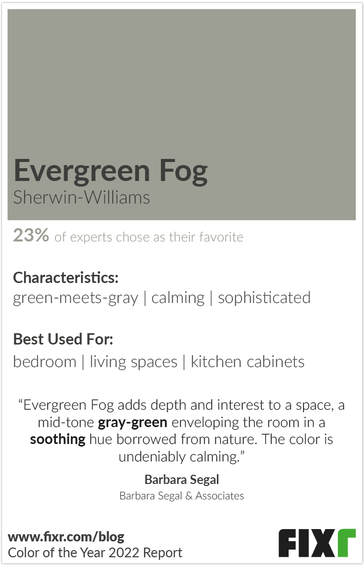
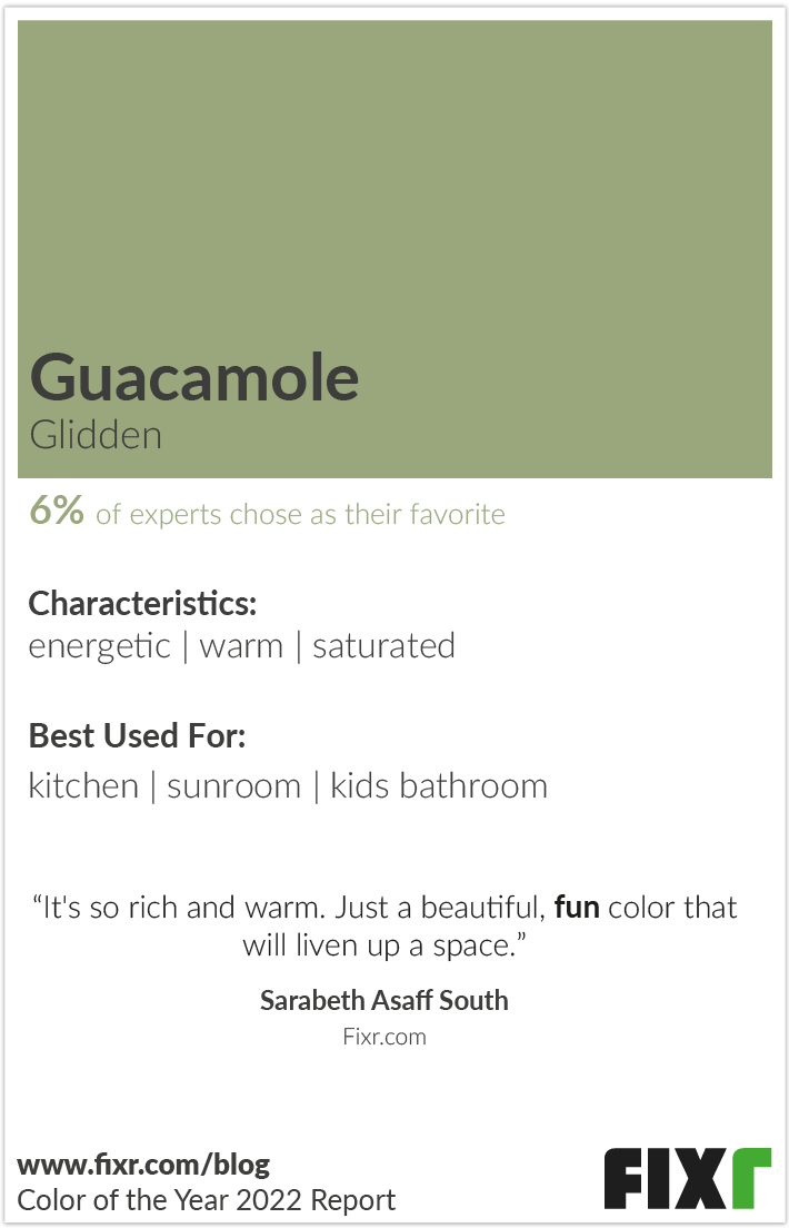
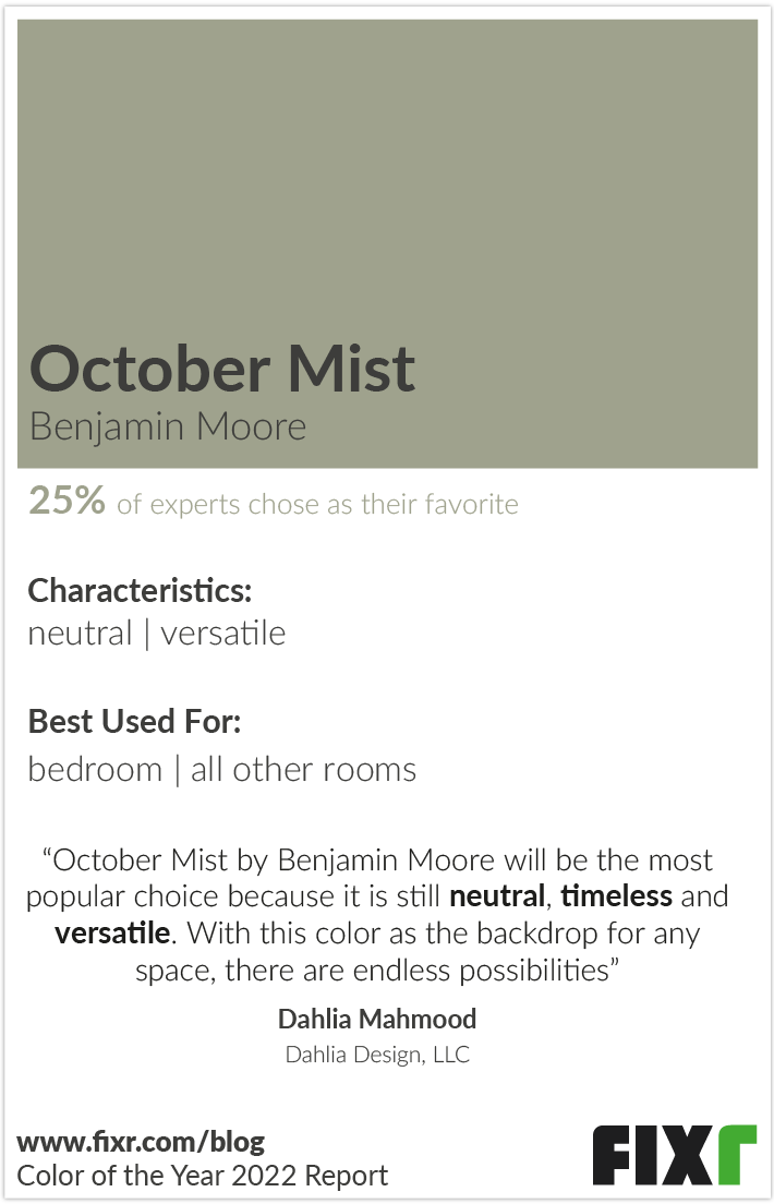
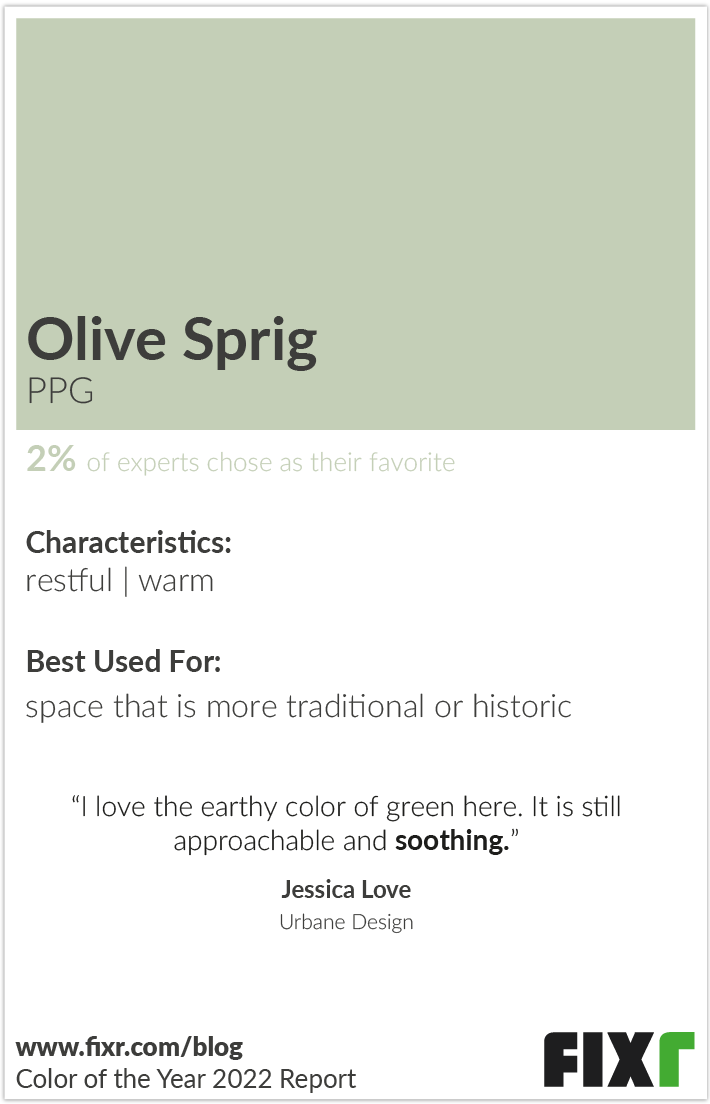
To help you make the most of each color, we’ve created these color cards to aid you in getting the most out of each one. The cards were created after analyzing all recommendations from home design experts, so you can truly understand the nuances between these similar shades. Each card can help you get a general feel of that color and what makes it different from the others by showing you a large swatch of the color so you can compare for yourself. Included in each card are the room’s they are most often recommended for, and the characteristics that set that color apart from the others. You’ll also see how many experts preferred each color, and some of the reasons why they like it for homes.
There’s More to Green than Color
While many years the colors that are put out by the major paint brands can be strikingly different from one another, 2022 looks to be distinct. With many variations on a single theme, it seems that nature will be the focus of the year ahead. Whether you’re an industry professional or a homeowner, you can use these colors as a springboard to finding growth, new beginnings, and new opportunities in your own homes and work in the coming year.
Methodology
We contacted 49 top interior designers currently working in the home design industry with their finger on the pulse of the latest trends. They were asked to respond to an array of questions, both multiple choice and open-ended. The experts are based in different regions from across the nation to gain the best possible range of knowledge and opinions.
We used the eight major paint brands’ choices for color of the year as focus for the questions. The brands and their color choices are mentioned in the article. The experts’ responses were gathered to create the graphics featured to clearly visualize their ideas and insights.
-
 Alene Workman
 -
 Ally Whalen
 -
 Barbara Segal
 -
 Birgit Anich
 -
 Cheryl Kees Clendenon
 -
 Corey Willis
 -
 Dahlia Mahmood
 -
 Ellen Kennon
 -
 Garrison Hullinger
 -
 Helen Bartlett
 -
 Henrietta Heisler
 -
 Jackie Santos
 -
 Jayne Michaels
 -
 Jennifer Gainer
 -
 Jessica Klein
 -
 Jessica Love
 -
 Joan Kaufman
 -
 Joann Kandrac and Kelly Kole
 -
 Joe Nahem
 -
 Joy Moyler
 -
 Karen Otto
 -
 Kathleen Jennison
 -
 Kerrie Kelly
 -
 Kevin Francis O'Gara
 -
 Kristie Barnett
 -
 Lee Cavanaugh
 -
 Linda Merrill
 -
 Lisa Mende
 -
 Lisa M. Smith
 -
 Lynda Quintero-Davids
 -
 M. Grace Sielaff
 -
 Marshall Erb
 -
 Michelle Cortizo
 -
 Mitch Newman
 -
 Patti Johnson
 -
 Raquel Skrobarczyk
 -
 Rayman Boozer
 -
 Rose Dostal
 -
 Sarabeth Asaff South
 -
 Sara Plaisted
 -
 Sarah Fogle
 -
 Stephanie Janecek
 -
 Suzanne Lasky
 -
 Susan Serra
 -
 Timothy Corrigan
 -
 Todd Davis
 -
 Trip Haenisch
 -
 Veronica Solomon
 -
 Wanda S. Horton


